Case study
Vega Blue
Branding and a focused landing page for a consulting, advisory and investment business. A distinctive identity, a clear offer and a direct path to enquiry.
Vega Blue
Branding
Landing page design & build
Consulting, advisory & investment
Credibility, with a clear point of view.
Vega Blue supports early-stage online businesses with advisory and investment expertise. For a business built around experience and direct relationships, its online presence needs to make the offer clear and give people a reason to take the next step.
We created the branding and built a focused landing page, bringing the identity and website together into one consistent first impression.
A distinctive identity.
A considered tone.
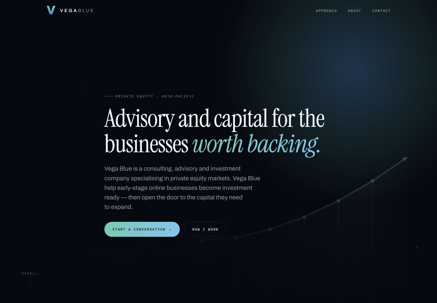
The visual identity pairs a sharp V mark and a spaced wordmark with a deep navy palette and blue-green accents. It gives Vega Blue a recognisable signature that carries naturally into the website.
Expressive serif headlines bring character to the page, while clean supporting type keeps the information easy to scan. The contrast between dark and light sections creates a clear rhythm, with the accent colour drawing attention to the important details.
One page.
A clear way through.
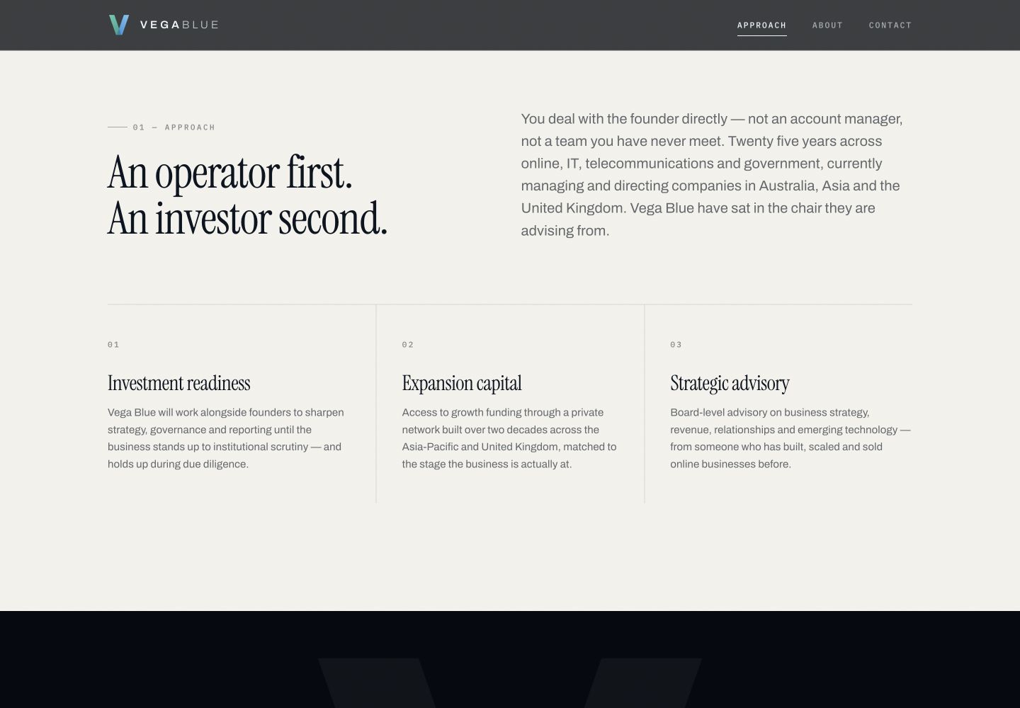
The page moves from an introduction to Vega Blue’s offer into its services, founder background and contact details. Each section has a purpose: explain what the business does, show the experience behind it and make starting a conversation straightforward.
Anchor navigation lets visitors move directly to the information they need. A prominent enquiry button, readable service descriptions and a personal founder section help turn a specialist offer into an approachable website.
The same identity.
A smaller screen.
The landing page carries the brand through to mobile, with stacked content, clear typography and a prominent contact action. The layout adapts while keeping the message and visual character consistent.
The finished result is a cohesive brand and landing page that give Vega Blue a distinctive presence and a clear place to begin a conversation.
View the full landing page screenshot ↗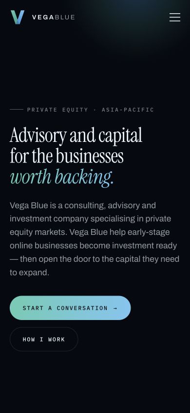
Ready for a stronger
first impression?
Let’s give your business a website with a clear direction.
Explore our website plans ↗